

A website can load quickly and still feel broken.
A visitor starts reading a paragraph and the text suddenly jumps downward. They move their cursor toward an “Add to Cart” button and an image loads above it, pushing the button out of position. They try to tap a navigation link on mobile, only for a cookie notice or promotional bar to appear at the top of the page.
These are not minor visual imperfections. They are layout shifts, and they can make a polished WordPress website feel unstable.
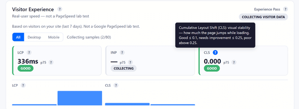
Google measures this problem through Cumulative Layout Shift, usually shortened to CLS. CLS is one of the three Core Web Vitals, alongside Largest Contentful Paint (LCP) and Interaction to Next Paint (INP). It measures visual stability: how much visible content unexpectedly moves and how far it travels.
Google recommends keeping CLS at 0.1 or lower for at least 75% of page visits. A score above 0.25 is considered poor.[1]
That does not mean every page must become visually plain. Beautiful WordPress sites can still perform well. The real goal is to build attractive pages that reserve space intelligently, load assets predictably and avoid inserting disruptive content after visitors begin interacting with the page.
Why CLS matters for users and SEO
CLS matters because visual instability damages trust.
A layout shift can cause visitors to lose their place while reading, click the wrong button or feel that a website is poorly built. On a WooCommerce store, the consequences can be more serious. A customer may struggle to select a product variation, miss an important checkout field or tap the wrong interface element on a mobile device.
Google also recommends achieving good Core Web Vitals for success with Search and a better general user experience. Core Web Vitals are used by Google’s ranking systems, although they do not replace relevance, content quality or other ranking considerations.[2]
This is worth treating as a sustained optimization priority rather than a one-off technical exercise.
A useful real-world example comes from Telegraph Media Group. After identifying and addressing layout instability, the publisher improved its 75th-percentile CLS from 0.25 to 0.1 within a couple of months. The share of users receiving a good CLS experience increased from 57% to 72%.[3]
That is a meaningful improvement in the experience delivered to actual readers.
The four most common causes of CLS
Google’s web.dev guidance identifies four recurring causes of poor CLS:[1]
- Images without dimensions
- Ads, embeds and iframes without dimensions
- Dynamically injected content
- Web fonts
WordPress sites frequently introduce all four.
Page builders make it easy to add media-heavy sections. Plugins inject forms, reviews, chat widgets, cookie notices and promotional banners. Themes load custom fonts. WooCommerce templates introduce product galleries, notices, stock messages and cart fragments.
The first step is understanding that CLS is not caused by “WordPress” in the abstract. It is caused by elements arriving late or changing size after the browser has already started positioning the surrounding content.
Reserve space for images before they load
Images are one of the easiest places to reduce layout shifts.
When an image loads without a defined width, height or aspect ratio, the browser may not know how much space to reserve. The page begins rendering without the image. When the file arrives, the browser creates room for it and pushes everything below it downward.
This often happens in WordPress when custom templates, page-builder widgets or poorly coded plugins strip useful image dimensions from the markup.
The solution is simple in principle: every important image container should reserve the correct amount of space before the file appears.
This matters for:
- Hero images
- Featured images
- Product photos
- Blog thumbnails
- Testimonial portraits
- Logo carousels
- Gallery slides
- Embedded videos
- Before-and-after widgets
A designer may create a beautiful full-width hero banner with a large lifestyle image, an overlay headline and a button. But if the hero container does not have a stable aspect ratio or minimum height, the entire introduction can jump when the image appears.
Sitetrail Turbo can support this process by optimizing images locally, converting files into WebP and AVIF formats, resizing oversized uploads and applying lazy loading where appropriate. Smaller image files can arrive faster and reduce the time during which a page remains visually incomplete.
However, compression alone does not solve CLS. The WordPress template must still reserve the correct space.
Lazy load carefully: not every image should wait
Lazy loading is valuable because it delays offscreen media until visitors move closer to it. That reduces unnecessary network work during the initial page load.
But lazy loading must be applied selectively.
The main hero image, featured product image or other likely LCP image should generally not be treated like an image far below the fold. Google’s Lighthouse guidance warns against lazy loading critical above-the-fold images because doing so can delay the appearance of the most important visible content.[4]
Sitetrail Turbo includes lazy loading controls, hero-image exclusions and LCP-image preloading. These features help reduce the risk of treating every image identically.
The practical rule is straightforward:
Lazy load what visitors cannot yet see. Prioritize what defines the first screen.
Watch for beautiful design elements that become CLS nightmares
Some of the worst CLS problems come from design ideas that look excellent in a mockup.
A rotating homepage hero slider may appear sophisticated, but it can become unstable if each slide has a different height or image ratio.
A slim promotional bar announcing “Free shipping this weekend” may seem harmless, but if it is injected above the navigation after the page loads, the header and every visible element below it may move.
A sticky header can create problems if it shrinks dramatically after scrolling or if its mobile height changes when icons, search tools or account buttons appear.
A product page may look impressive with a review widget, stock indicator, payment badge and shipping calculator. But if those elements load late above the Add to Cart area without reserved space, the purchasing interface can jump around.
Other common examples include:
- Cookie banners inserted above the content instead of overlaid safely
- Chat widgets that expand automatically
- Newsletter forms that appear after a timed delay
- Social-media embeds without fixed dimensions
- Recommendation carousels added beneath an article after rendering
- Accordion sections that open automatically
- Personalized content blocks that replace placeholders with taller content
- Image galleries where portrait and landscape media share the same unrestricted container
- Promotional countdown timers loaded through external scripts
- Font changes that cause headings to wrap onto an additional line
The right response is not to ban these features. It is to design them with stable containers.
Fonts can shift more than expected
Typography is often overlooked.
A custom font may load after the fallback system font has already rendered. If the two fonts have different widths, heights or line spacing, headings and paragraphs can reflow.
A two-line headline becomes three lines. Buttons become wider. Navigation labels wrap. Product-grid cards change height.
The solution is not necessarily to abandon distinctive fonts. Instead:
- Use a limited number of font families and weights.
- Load critical font files efficiently.
- Choose fallback fonts with similar proportions.
- Define stable line heights.
- Test mobile layouts carefully.
- Avoid designing headers that only work when every font loads perfectly.
A design that depends on millimeter-perfect text wrapping is fragile.
Delayed JavaScript can improve speed but create new shifts
JavaScript optimization requires judgment.
Delaying non-essential scripts can improve loading and responsiveness. But if a delayed script inserts content into the visible page without reserved space, it can create post-load CLS.
Examples include review badges, pricing calculators, chat widgets, product recommendations, popups and embedded forms.
Sitetrail Turbo includes JavaScript minification, deferral, delayed execution, safelists and per-script exclusions. It also includes restore points, change logs and rollback protections.
These tools matter because the correct approach is not “delay everything.” It is:
Delay non-essential scripts, exclude sensitive scripts and test what happens after the page appears.
The same applies to CSS optimization. Remove Unused CSS and asynchronous loading can reduce asset weight, but critical above-the-fold styling must remain stable. Sitetrail Turbo includes local Remove Unused CSS, local critical CSS generation, preview tools and compatibility safeguards to reduce the risk of aggressive changes creating a visual regression.
Measure real visitors, not only laboratory tests
CLS is especially important to monitor in the field.
Google notes that lab tools may not always show the full CLS experienced by real visitors because a basic lab test often captures only the initial page load. Layout shifts can also happen later, after delayed scripts, dynamic content or user journeys trigger new elements.[1]
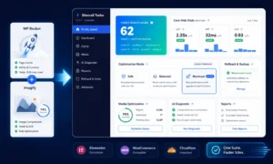
Sitetrail Turbo addresses this through its Visitor Experience™ dashboard. It tracks real-user Core Web Vitals, including CLS, using sampled background beacons and local aggregate storage.
This makes it easier to spot a crucial pattern:
A homepage may look stable during a test, while product pages, mobile templates or long-form articles still produce layout shifts for actual visitors.
The plugin stores aggregated metrics locally and allows site owners to monitor trends rather than relying solely on a one-time score.
For a serious CLS audit, combine field monitoring with template-level testing:
- Review desktop and mobile CLS separately.
- Identify templates with poor results.
- Test representative URLs.
- Inspect the specific elements that move.
- Fix the underlying design rule.
- Monitor whether real-user CLS improves over time.
A WordPress CLS checklist that actually works
When diagnosing CLS, work through the website systematically.
Start with images. Confirm that visible media has dimensions or stable aspect-ratio containers. Check heroes, product images, thumbnails and galleries.
Then review dynamic blocks. Reserve space for ads, videos, embeds, reviews and recommendations. Avoid inserting banners above content after rendering.
Review fonts. Compare fallback and final font behavior on mobile and desktop.
Audit JavaScript. Check whether delayed scripts inject visible elements. Exclude sensitive scripts where necessary.
Inspect sticky UI elements. Test headers, promotional bars, cookie notices, chat tools and floating buttons across screen sizes.
Review WooCommerce flows. Test product pages, variation selectors, Add to Cart sections, carts and checkout pages while logged in and logged out.
Finally, monitor real users. CLS problems are often template-specific and device-specific.
The final lesson: stable design is good design
Avoiding layout shifts does not mean sacrificing creativity.
It means treating stability as part of the design itself.
A polished WordPress website should not merely look beautiful once every file has loaded. It should remain coherent while loading, while scripts execute, while fonts appear and while dynamic content updates.
Sitetrail Turbo can help by optimizing images, handling WebP and AVIF conversion, applying careful lazy loading, managing CSS and JavaScript optimizations, supporting exclusions, tracking real-user CLS and providing rollback tools.
But the most reliable results come when plugin-level optimization and thoughtful page design work together.
The best WordPress websites do not force visitors to chase moving buttons, rediscover displaced text or wait for the interface to settle down.
They feel stable from the first moment they appear.
Source Data:
Google Search Central confirms that Core Web Vitals measure loading, interactivity and visual stability, and that Google recommends good Core Web Vitals for Search success while emphasizing that page experience is not a substitute for relevance or content quality.